core_error
THE GAME
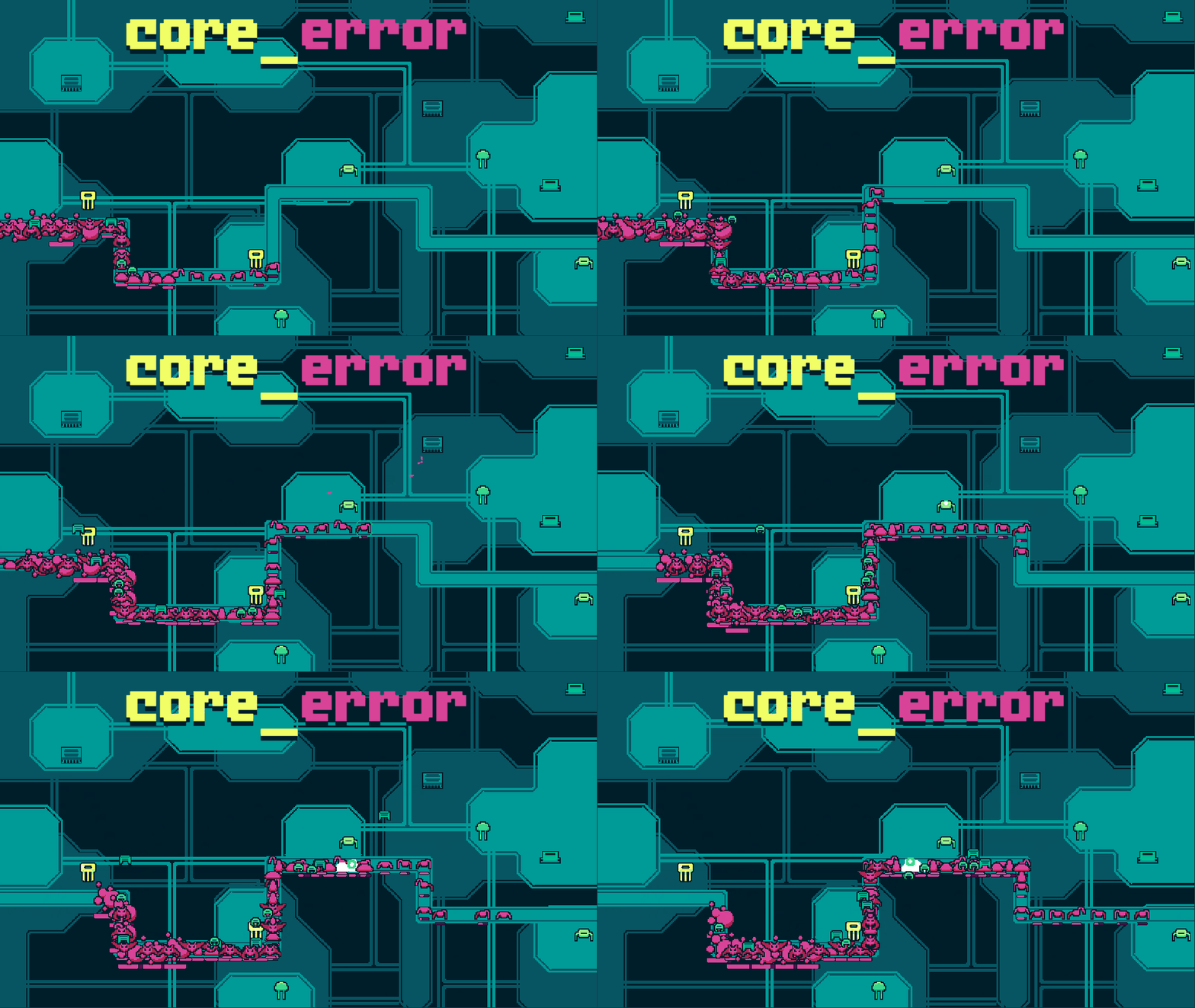
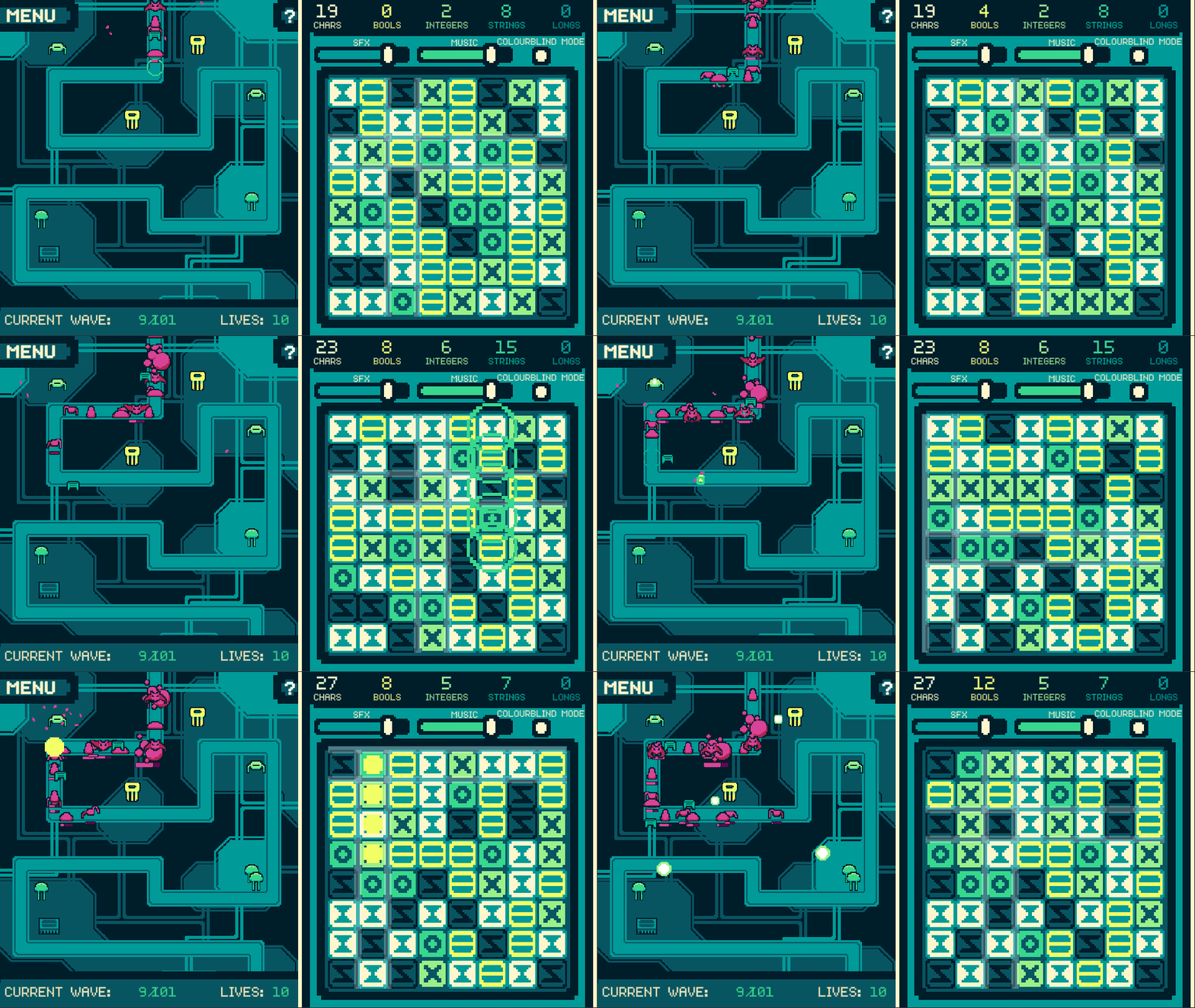
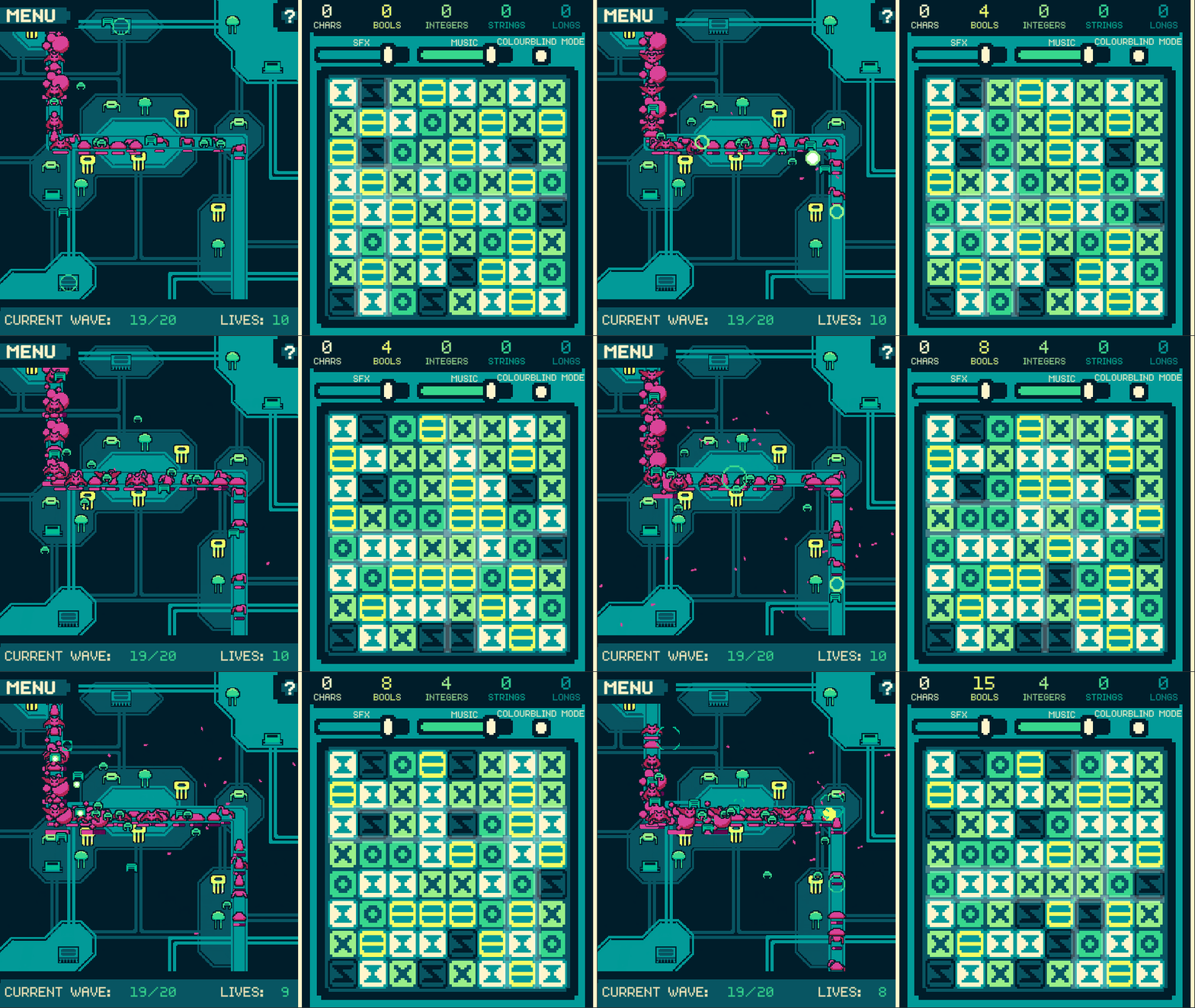
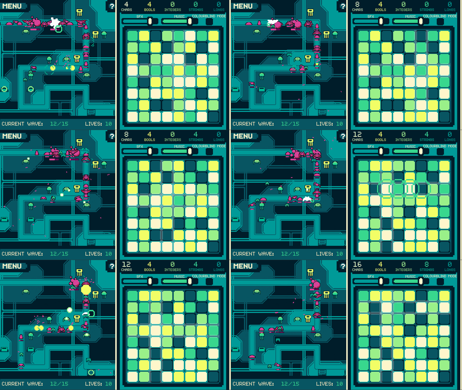
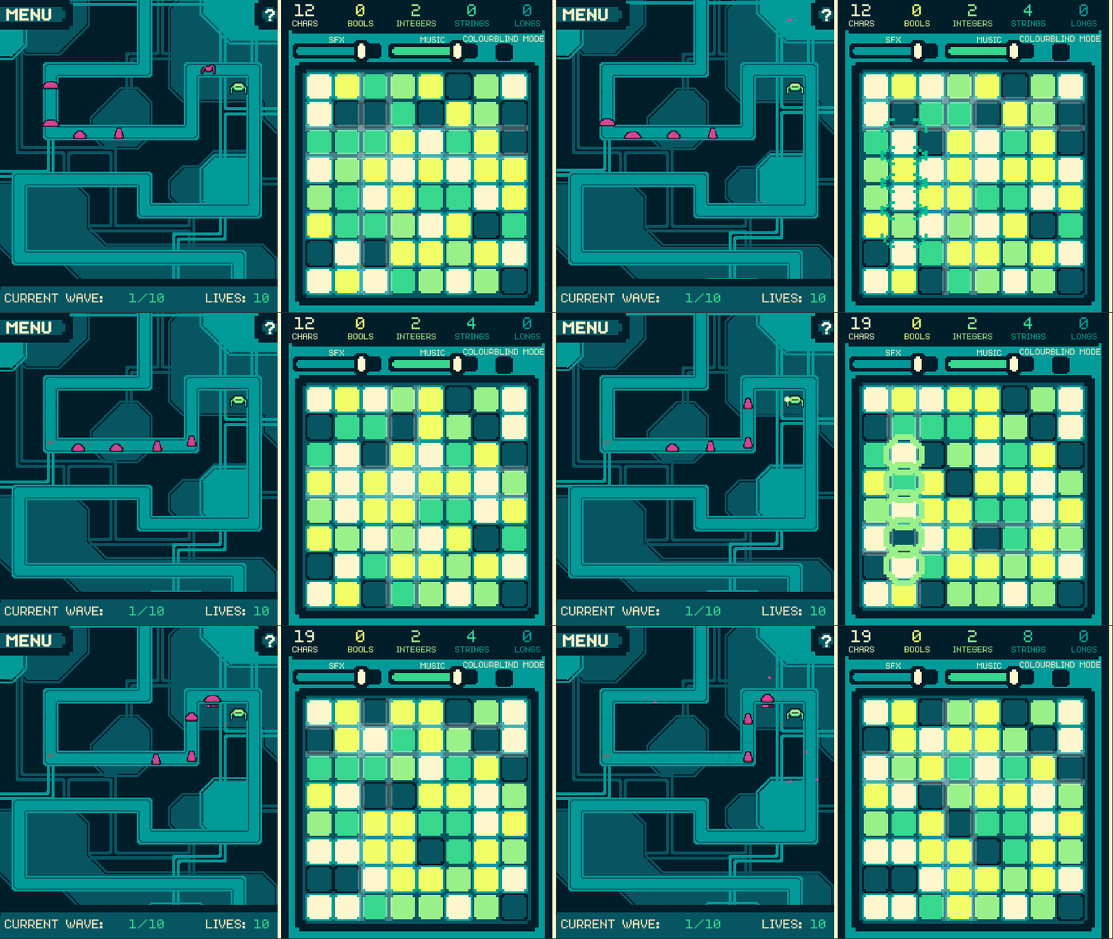
The system has been struck by a swarm of malware, and it's up to you to stop it! Unfortunately, you're not the one in charge of defences. The disk, on the other hand, is all fragmented, and nobody's cleaned it for months! Can you reorder everything, provide the system resources needed to fight off the horde, and avoid having your PC used as a bitcoin miner?
If it gets difficult telling the different coloured tiles apart, you can turn on colourblind mode to add symbols to the tiles! You can use it even if you aren't colourblind (probably).
THE CONTROLS
Controls are said to be:
- Mouse to drag around tiles on the grid, hover over things, click things and so on
And that's all you need!
MY THOUGHTS
It's interesting to look at this game and then the tower defence game I made about a year ago, Attack on Alderia - even though I had less time to make this one, it definitely has more content, which is impressive! It doesn't feel like I've improved that much, but clearly something must have happened between now and then. As for the game as it stands now, I like it; it has a decent amount of content, a fairly unique mechanic, an actually competent AI system, and a match-4 grid that I wasn't sure would work when I started. That being said, I also would've liked a little more polish, some sort of introduction, a better menu and UI and so on, though I guess I can't have it all. And, who knows, maybe I'll have added all that in the next tower defence game I make a year from now! I hope you enjoy playing the game as I had figuring out how it'd work, and do tell me if you beat all 3 levels - I'd love to hear!
| Status | Released |
| Platforms | HTML5 |
| Rating | Rated 5.0 out of 5 stars (1 total ratings) |
| Author | Cakestorm |
| Genre | Puzzle |
| Made with | GraphicsGale, Unity, Audacity, ChipTone |
| Tags | 2D, computer, Pixel Art, Retro, Tower Defense |
| Code license | Unlicense |
| Asset license | Creative Commons Zero v1.0 Universal |
| Average session | A few minutes |
| Languages | English |
| Inputs | Mouse |
| Accessibility | Color-blind friendly |
Comments
Log in with itch.io to leave a comment.
I love it a lot, probably my favorite game of the jam! The concept is awesome and the execution is also fantastic! Can't believe you did it in 3 days!
Love the game, probably my favorite thus far.
I want to say the concept is great and the execution is fantastic. One thing though is the dual-gameplay kind of is hard to manage as a player. You end up just watching the match-4 and not care about the tower defense, just making sure that you create enough ingredients of each type.
The shades of green are kinda hard to read sometimes.
Bonus points for the data types as ingredients names.
I know this would have asked more time and playtesting but I think there would be some tweaking to do in order to make the player strategize what data-types they create.
Yeah, the gameplay did get a bit one-sided like that, though I didn't want to overload (haha) the player by having to play 2 games at once. Still, I agree they could've involved each other a bit more, definitely! And that's a good point as well, having to strategise a bit more, since as it stands you can just sort of match anything. I'll definitely look into it, thanks for the feedback!
Brilliantly done for a 3 day jam!
Definitely a visual step up from Attack on Alderia, I love the choice of color palette.
Colorblind mode is a godsend, but it would be much better if it remembered the setting as you move to the menu and back into a game.
Playing the match-4 often feels disconnected from the tower defence. Though obviously a lot more work ,it would be great to see the game switch between the two. eg. You get 20-30 seconds of match-4, and then use those resources to build towers and a wave comes in. Different towers cost different resources, so you can go into the match-4 searching for specific combos.
Ah, I knew I'd forgotten something simple, I could've easily made it remember colourblind mode - I'm kicking myself for that one! And I like the idea you have there about switching modes, it would've tied the two halves together better. Still, I'm glad you liked the visuals, and thank you for the feedback!