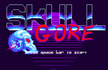
Skull Gore
Prompt: Create a 1 button game with the theme: audio.
The one button is space on PC and a screen press on mobile.
Tap to shoot, hold to stay still.
Also on the PC vesion:
The R key exits the level at any time.
Plus and minus adjust the volume.
| Status | In development |
| Platforms | HTML5 |
| Author | Dev Pirates |
| Genre | Action |
| Made with | Phaser |
| Tags | Music, one-button, Pixel Art |


Comments
Log in with itch.io to leave a comment.
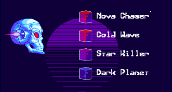
This is really cool. Feels like a proper arcade game and especially like how you choose to select the song at the start by firing and the whole presentation in general is excellent
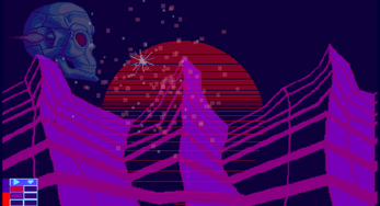
I'm still not sure what the bottom left graphics are for but still able to enjoy the game. I eventually discovered the secret to not missing any of the items on screen and my spacebar is very tired now :D I think the time different between a tap and a hold is what stumped me at first. The tap gesture isn't very forgiving, but I figured it out after a few tries.
The music and backgrounds do a great job of setting the mood! Nice job!
I tried to make their purpose evident through playing. There is a life bar on the far left, and two track lists. One track list shows the currently playing tracks, red, purple, and/or blue. And the second one shows the queued up tracks. When a music box is killed a little particle moves the track into the queued tracks. When the current sections is complete the queued tracks become the playing tracks.
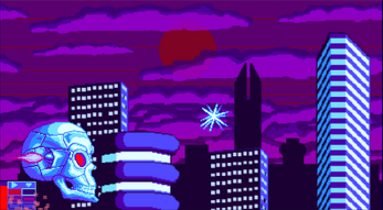
The tracks being played also correspond to the backgrounds being displayed.
I had thought about limiting the shooting, but decided against because I didn't want it to become frustrating.
Thank you for playing.
Ah I see. That actually makes sense. Thanks for the explanation. It didn't take a way from enjoying the game, I just wasn't putting it together at the time. As for the shooting, I didn't figure that out until I had played several times lol.
Yeah, UI design is not my strongest skill and I still have a lot to learn and improve in that area. Like David Dawn said, an explanation would have gone a long way to help people play the game. Also, I could have made the hold and press more forgiving without messing anything up.
Aye, I can see that. Shooting things tends to be the default for me. This was never brought up by the few people I had play test it, so I appreciate you bringing it up. There's always a blind spot.
Yeah, getting the player into the game with as little hassle as possible is usually better. I can see for different types of games maybe starting the player off disoriented and needing to figure things out helps with getting the mood right, but it's not good for this kind of game.