A sketchnote travelogue from the International Sketchnote Camp 2024 in San Antonio, Texas

Sharing a visual taste of my wonderful experiences at ISC24TX in San Antonio, Texas while capturing these precious moments for myself.

Two weekends ago, I had a fantastic experience at the International Sketchnote Camp (ISC24TX) in San Antonio.

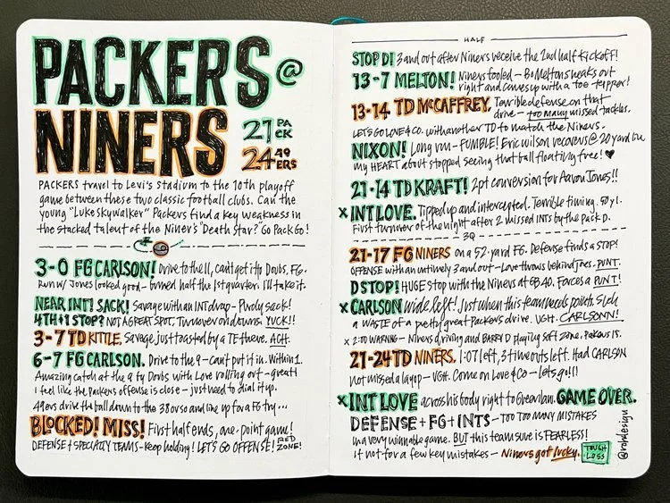
Since last year, I’ve made it a tradition to capture my travelogue in sketchnote form — with images, drawings, and writing on my iPad Pro in Paper by WeTransfer. You can see my sketchnote travelogue from 2023 right here.

So, I present to you these sketchnotes so you can have a taste of the fun that weekend:

Special thanks to my good buddy and event organizer, Professor Michael Clayton. He did amazing work, mostly by himself, to make the ISC24TX event happen. I played a small part in the organization, but Prof truly made it happen.

Thanks, Mike!

A tale from “ye olden days” of graphic design that taught me to love and embrace constraints

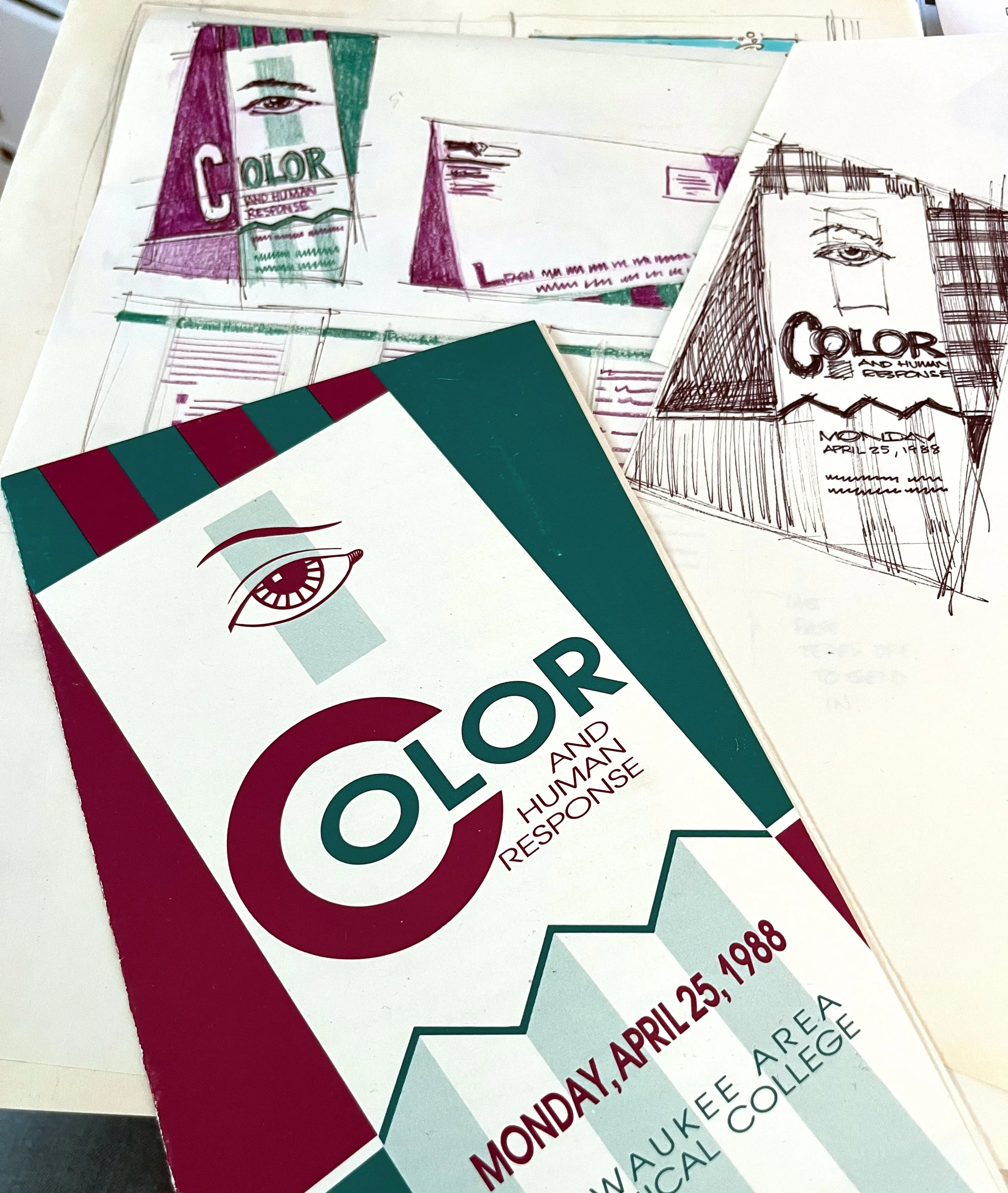
Black and white, color sketches, and the final project from a design job, 1988.

Traditional graphic design in “ye olden days,” before computers revolutionized the design scene, was slow, labor-intensive, and, much of the time, a royal pain in the butt to do.

However, I feel fortunate to have been a design student when I was because it taught me to love and embrace constraints.


Here’s how I define the “ye olden days” for a little context:

It was eons before Figma layouts in the browser, a millennia before the iPhone put the world in your pocket, and a century before Adobe Photoshop would crash in a flash of pixels, taking hours of my design work into the digital netherworld.

I’m talking real old-school — 1988, baby.

It was an earlier time filled with layout boards, non-repro blue pencils that made lines invisible to production cameras, technical ink pens to create registration marks, and typography and photography output on photo paper.

It was hardcore analog, with nearly everything done manually.

In the late 1980s, I worked part-time as a student designer at Milwaukee Area Technical College’s Design Centre, which was the college’s in-house print design agency.

While I only earned minimum wage, I gained precious experience designing real projects with real deadlines for real clients. We did various projects, from brochures and signage to a monthly magazine.

Fine Tuning magazine was a significant recurring design project we cranked out monthly. The magazine promoted upcoming TV shows on the local public TV station with feature stories, advertising, and monthly schedule listings.

Here’s what designing a feature article for Fine Tuning Magazine looked like.

Sketching was the only option, my dude

This was before the desktop publishing revolution, and everything started with sketches — because that’s all we had available to convince the art director our designs would work.

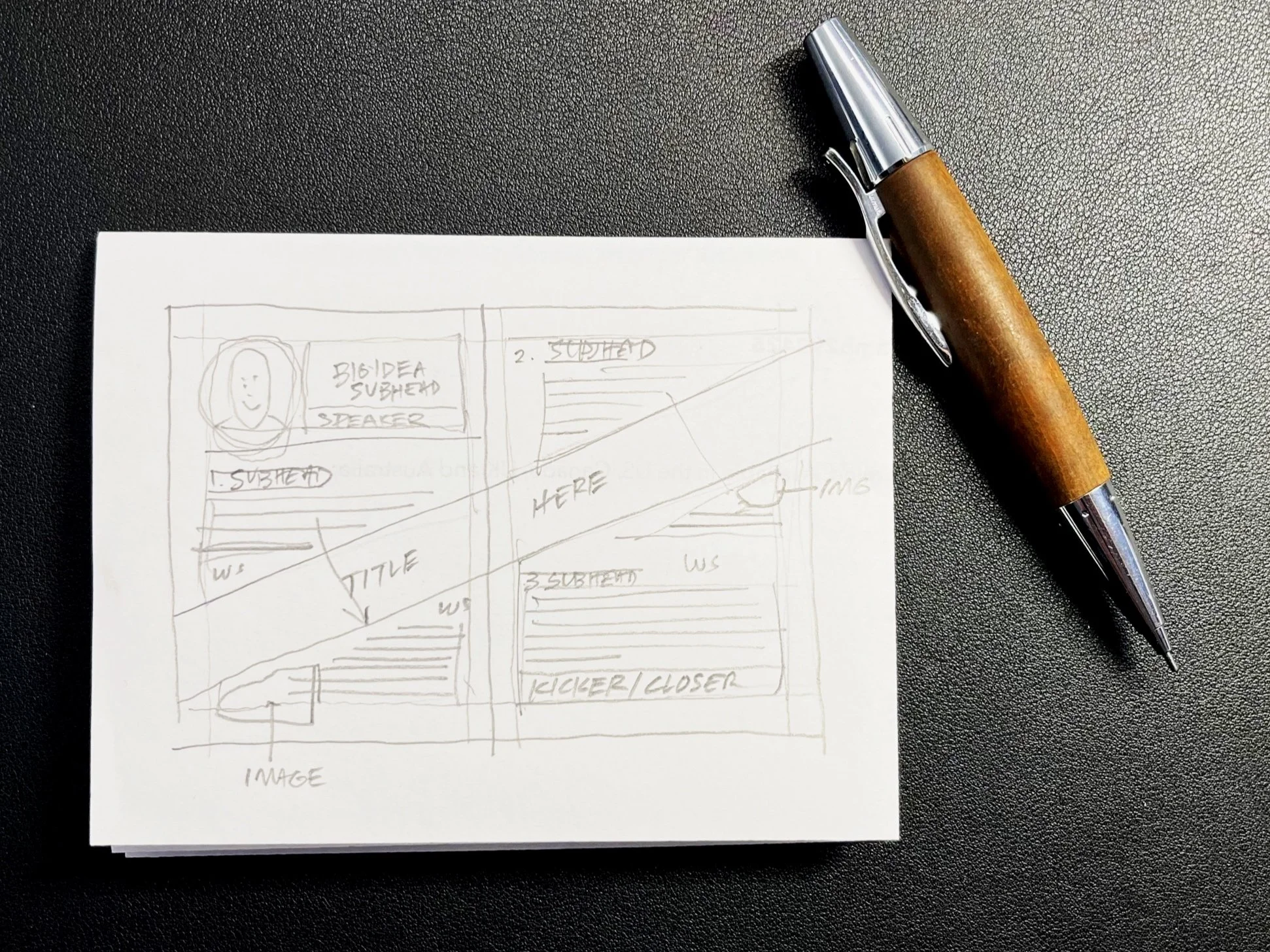
Pencil thumbnail sketches for a design project.

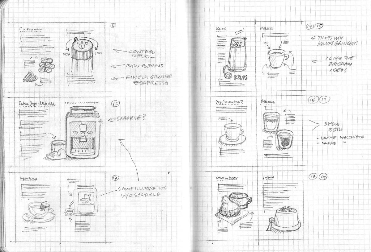
I would begin with thumbnail-sized pencil sketches to explore options. This let me play with the positioning and spacing of headlines, text, photos, and illustrations before committing to more work.

Once satisfied with the design direction, I moved to full-scale, detailed pencil sketches to validate that an idea was workable and worth creating.

With more clarity, I’d spend a few hours making a hand-made comprehensive mockup, often at a 1:1 scale, with the main elements sketched out using a black pen and finished with color markers.

A color mockup at half-size.

I liked including detailed notes about typeface choices, colors, and body text sizes on my mockups. Looking back, it’s fascinating how much these noted details on my design mockups influenced my current sketchnoting practice.

Type specification, oh, how I hated thee

Once my design was completed, I needed to specify the typography for the paste-up. Since there was no way to play around with font sizes or spacing, type specification was annoying but necessary.

This math-heavy process involved a special ruler called the “Haberrule” to calculate the number of typed characters, measure the line width, and match it to the available space on the layout.

The Haberrule, the bane of my existence.

Type specifications went to the type compositor, the person who ran the typesetting machine. I called this process guesstimation because you didn’t know exactly what you might get back.

If my specs made the type too short, I’d need to add space around the type and other elements in my paste-up. If it were too long, the layout elements would need to get tighter to make it all work.

If the type output were bad enough, I’d have to request a re-run. This was a roulette wheel of possible outcomes ranging from “Leave me alone, dummy…” to a begrudging “OK, fine. Now go away, silly designer!”

I was quite motivated to get my type specs right the first time.

Phototypesetting was state-of-the art in 1988

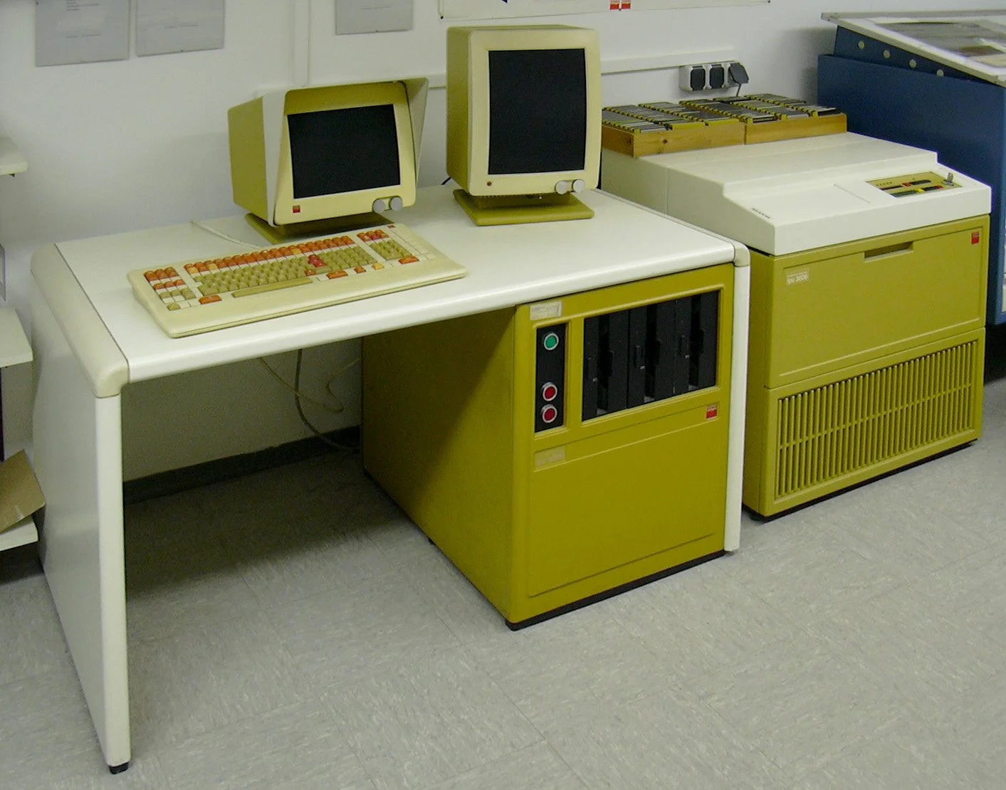
How was type made back in those days? We had a phototypesetting machine that could generate black-and-white headlines and paragraphs of body copy on photo paper rolls.

A 1980s phototypesetting machine.

From a speed and safety perspective, it was a huge advancement over the slower, more dangerous hot metal-type systems that came before it.

But… our phototypesetting machine only had ten typeface options! Of those, Helvetica, Palatino, and Times New Roman were the only fonts really worth using.

This presented a problem, particularly with magazine layouts: being a huge fan of design magazines Communication Arts and PRINT, I wanted to use cool headlines and exciting layouts in my article designs.

Ten typefaces would not cut it.

As fortune would have it, we had two things in our studio that helped me get around the ten-typeface problem:

  1. A photostat camera in the back of our studio. This giant, stationary camera was designed to reproduce black-and-white images at different sizes, ready for print production.

  2. Stacks of type specimen catalogs filled with hundreds of unique typefaces. Each catalog contained two-page spreads with an entire alphabet, numerals, and special characters… perfect for photographing.

I’d page through the type catalogs until I found the perfect headline font for my magazine layout sketch.

I’d secure the book, spread side up, in the camera bed, take a shot with the photostat camera and print ten to fifteen copies of the typeface for paste-up.

Back at my desk with the stack of photostat typeface prints, I’d wax the sheets and methodically cut each letter out with an X-Acto blade knife.

Then, I would carefully place each glyph into my layout. I was a stickler for kerning (the space between letters) because I wanted the headlines to flow smoothly across the page.
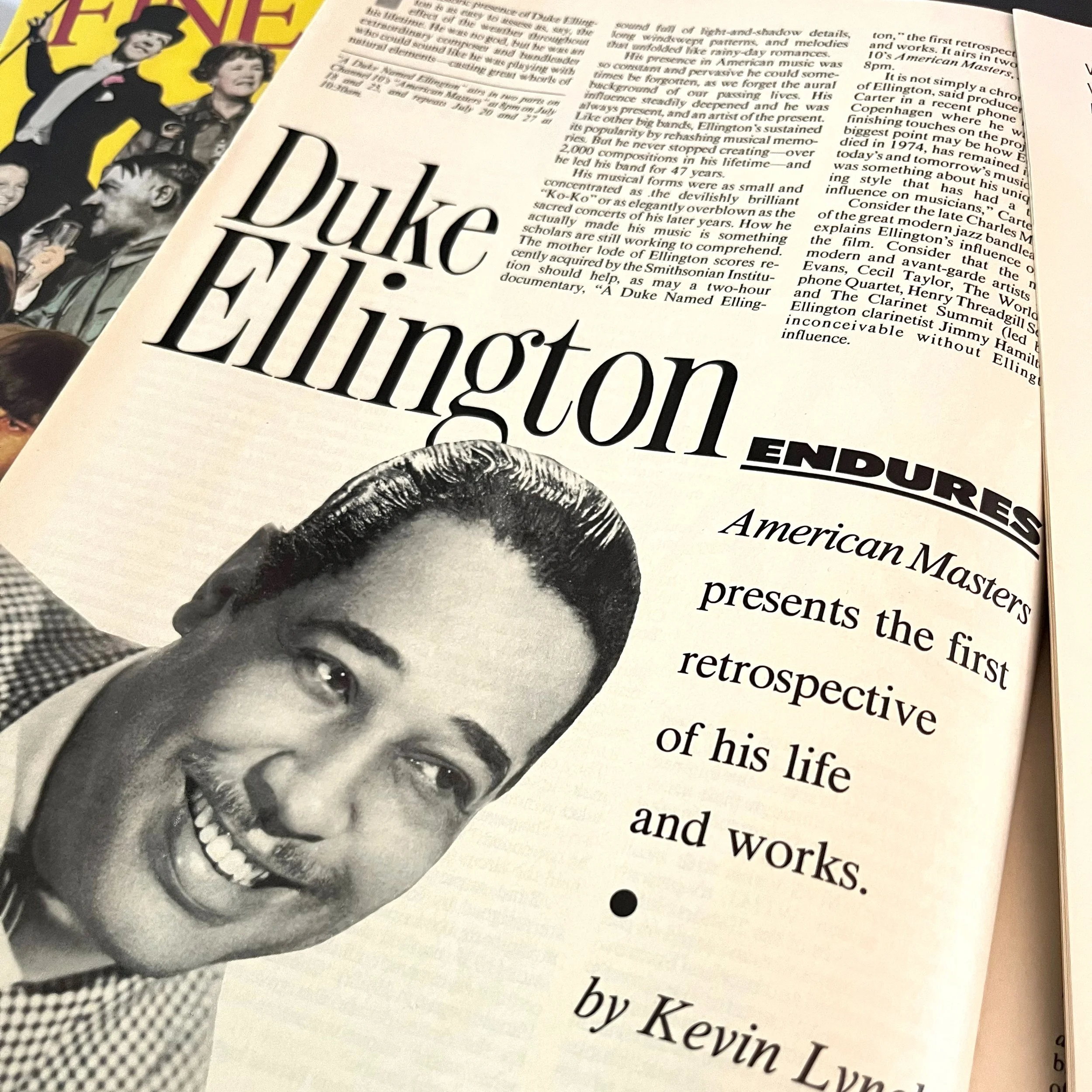
Fine Tuning spread for a Duke Ellington on American Masters.

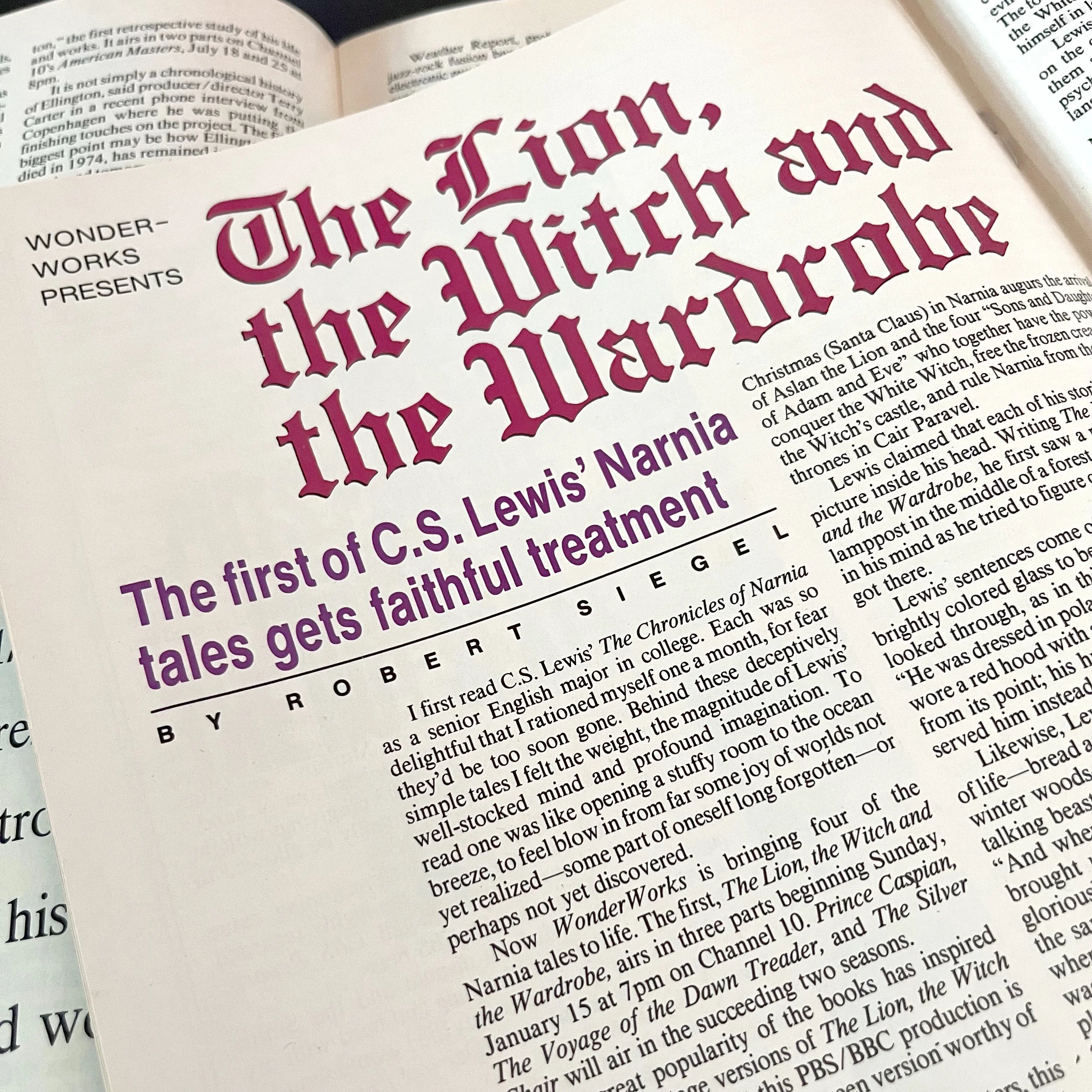
Fine Tuning layout for The Lion, the Witch, and the Wardrobe mini-series.

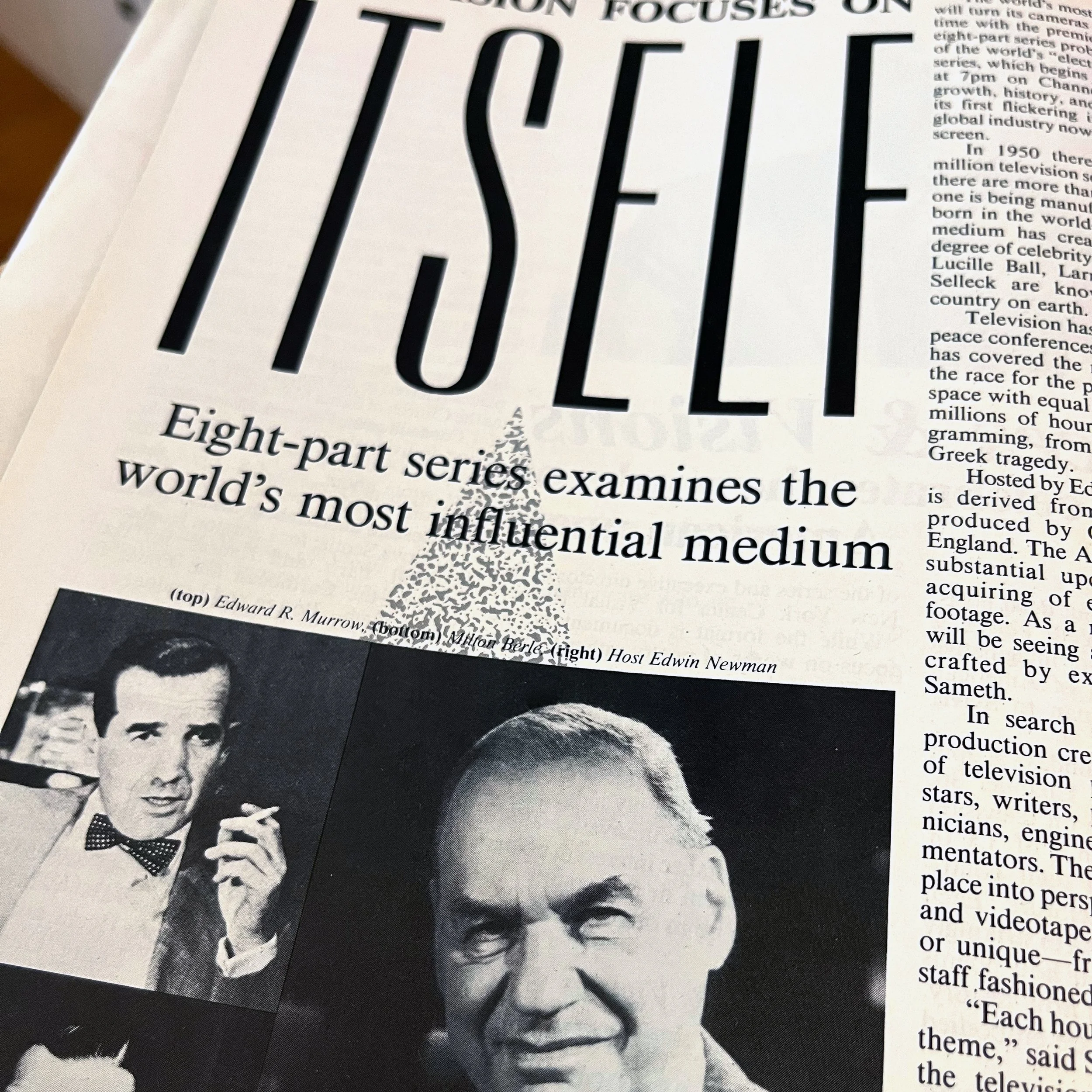
Fine Tuning spread for Television Focuses on Itself, an eight-part mini-series.

Embracing constraints taught me to love them

Through this process, I learned to love constraints. Getting beyond the ten-font type constraint required me to think creatively and solve problems differently.

My approach when I face constraints is:

  • What CAN I do with the resources available?

  • Is there another way to think about this problem?

  • What would someone with a growth mindset do in this situation?

  • What if I turn the problem upside-down? What ideas might fall out?

You might be surprised to find solutions hiding in your constraints.

Sauce Talk Podcast EP2: Detroit-Style Pizza with Andris Lagsdin

I spent a day with Andris Lagsdin, the inventor of the Baking Steel. We talked about my experiments with Detroit-style pizza and made a pizza together.

Here’s episode 2 of the Sauce Talk Podcast::

We also talked sketchnotes, and I shared the visual note I created while we prepared and made Detroit-style pizza:

Detroit-style pizza sketchnote.

10% Discount on Baking Steel!

Andris has created a special code for readers of the Rohdesign Weblog for 10% off a Baking Steel with the code STEELROHDE at bakingsteel.com at checkout!