Slaughter
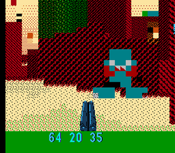
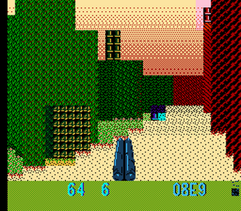
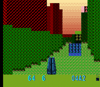
8-bit platforms deserve a higher class of ego shooter. Now with real levels!
CONTROLS: A to strafe / sprint / glide. B to fire. Select to switch weapons. Select+B to shoot a rocket.
Compressed level data finally works, but the in-game level editor still can't show or enter passwords. Placing portals might get simplified before that. There's also some rendering weirdness in the splitscreen multiplayer. None of this is a joke. These are real features, and they're almost correct.
| Updated | 15 days ago |
| Status | In development |
| Platforms | HTML5 |
| Rating | Rated 4.5 out of 5 stars (13 total ratings) |
| Author | Mindbleach |
| Genre | Shooter |
| Tags | cc65, Game engine, Homebrew, NES (Nintendo Entertainment System), NES ROM, Open Source, Singleplayer, Split Screen |
Download
Download
SLAUGHTER (halloween is cancelled).zip 274 kB
Download
SLAUGHTER (multiplayer visual fixes).zip 323 kB
Download
SLAUGHTER (now with levels).zip 322 kB
Download
SLAUGHTER (christmas smoothness).zip 221 kB
Download
SLAUGHTER (paltry july update).zip 232 kB
Download
SLAUGHTER (ceilings and editor alpha, with ROM (whoops)).zip 212 kB
Download
SLAUGHTER (ceilings and editor alpha).zip 192 kB
Download
SLAUGHTER (janky multiplayer alpha).zip 186 kB
Download
SLAUGHTER (NesDev22 compo final).zip 149 kB
Download
NES Slaughter October alpha.zip 111 kB
Download
NES Slaughter weapons update.zip 78 kB
Download
NES Slaughter announcement version.zip 60 kB
Download
slaughter-ninjapad-october.zip 220 kB
Download
slaughter (just-in-case build).nes 40 kB
Download
slaughter (just-in-caser).nes
Download
slaughter (just-in-casest build).nes 40 kB
Download
slaughter (nearly final).nes 40 kB
Download
slaughter (tweaks).nes 40 kB
Download
slaughter ninjapad final build.zip 225 kB
Download
slaughter-ninjapad-december.zip 227 kB
Download
slaughter-ninjapad-ceilings-february.zip 229 kB
Download
slaughter-ninjapad-portals.zip 230 kB
Download
slaughter-ninjapad-christmas.zip 295 kB
Download
slaughter-ninjapad-withlevels.zip 296 kB
Install instructions
NES ROM included. Mesen emulator recommended, but also tested in FCEUX. Compatible with overclocking.
Compile with cc65. Makefile included.
Development log
- Now with levels!Jan 31, 2024
- SLAUGHTER your friends!Dec 18, 2022
- So much blood!Sep 19, 2022







Comments
Log in with itch.io to leave a comment.
I'm a few levels and and the updates are awesome! Now there's a reason to use the bomb since you're rationing weapons now. My son immediately said it was much easier to see what has going on with the terrain. Levels are more varied in design with new colors. There are some new enemies. They can shoot what look like bombs maybe that are a different color. There's still a lot to take in.
I do have a question. Is the ever-present feedback sound on purpose or is that a bug? It's kind of jarring. I got used to it after a while but it took some doing. I thought the web emulator was glitching so I tried it in FCEUX, then Mesen, then flash cart and it was still there.
I haven't tried multiplayer yet but we'll probably get to that this weekend. It's very very cool to see you updated this today!🤘
Sorry about the buzzing. The HUD is kept stable by abusing the sample channel, which can only read from a particular region in the middle of ROM, and placing things there specifically is nontrivial. I had thought it was pretty quiet, but these headphones might not be very good. I'll somehow point it at all-zeroes in future ROMs.
The HUD has to use the background now (where previously it was solid gray that scrolled freely) so I could afford to show three ammo counters. I tried using two sprites as the endpoints of their shared gauge, but the budget per-line is eight, so no. Fortunately I was hopelessly stubborn about the sample-channel thing. The NES's audio chip is on a separate clock that only kinda lines up. Using it for timing is rough. But I got it to fire an interrupt anywhere within the first dozen lines of the HUD, which was enough to leave the top part boring and fancy up the bottom. Aaand then I got the range down to within two lines. I'm still not sure how. It has to play a noise to do this, and I will make that noise a period of silence.
Multiplayer currently has friendly fire disabled, purely because I made hitscan independent of rendering, and have not bothered to check for the other player. Multiplayer also has some head-scratching bugs whenever it goes back to singleplayer. I had to push this update with several cans still freshly-kicked.
This update is mostly behind-the-scenes. I spent a few months tweaking performance as hard as possible, to where everything's about twice as fast as the last version. That let me update sprites on every frame and move fireballs more often. The levels are nearly the same, albeit with the new palette stuff, which is smaller and faster. Floor / wall graphics are more flexible, so there's now more than four types, but several of them are still fugly. The sound effects are different, mostly picked from randomly-generated examples. I was having no luck reasoning about the NES's sound chip. I made it cheap to throw a byte into a function and get out some kind of sqwonk or breep. I've picked good ones for everything that should make noise and a few things that are funny when they make noise.
This was supposed to head toward a NESdev 2024 release. But I guess that's cancelled? Even the Discord look ambiguous. In any case this was all cleanup and prep to have it Done™ somewhere in November. That should still happen. I'm gonna keep freeing up space so I can cram in more levels. Make it feel more like a complete game. That's definitely something the ammo has already changed. The enemy pinatas finally matter!
this game is amazing i love zis i woul love if zis opwuld woudl turn into like sandbox game anddd yeeeeeess OUO
This is some damn good stuff right here
=0
Great work! Thanks for the new levels! I've gotta try the multiplayer out...
Hi! NinjaPad dev here. NinjaPad is not an emulator, it's an emulation front-end. The emulator you're referring to is "JSNES" which was the default backend of NinjaPad.
We have recently updated our emulation backend with a more accurate emulator - BinjNES. Go give it a try! :)
https://github.com/ninjadynamics/ninjapad
Thank you for the heads-up! Sorry for not being precise. JSNES lacked a sprites-per-line limit. BinjNES handles everything this ridiculous project relies on.
Show post...
Good :D
That is really amazing! :D
How do I compile the new version into an NES format? Or if I need to ask I probably shouldn't be messing with it right?
You'd need cc65 installed. I'm using v2.18, but the newer versions should work the same. In Windows you might as well install Windows Subsystem For Linux and use "make". But if you wanted to do it manually, or create a batch file, there's only four commands in the makefile. They're in reverse order. cc65 goes from slaughter.c to slaughter.s, ca65 goes from slaughter.s to slaughter.o, ca65 goes from reset.s to reset.o, and ld65 combines the .o files into slaughter.nes.
... I forgot to include a ROM in the update, didn't I. Lemme fix that real quick.
I got the ROM file thanks!
A new level! Yay! And more polish :)
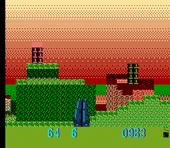
Ok. I've tried a few times to get into this version but I'm having trouble. The new red and green gradients are pretty disorienting for me. I used to be able to navigate everything pretty well but now for me it's too much visual noise to quickly discern surroundings. I liked it a lot more the way it was before with the sky being one color so it contrasts better with the terrain and enemies. I'm really excited to play a new map but I just can't tell what's going on.
Do the enemies melt or something now? I feel like they change shape when I'm firing at them.
I didn't do anything with the editor really. It looked neat though.
The sky was always a gradient, it's just upside-down and higher-contrast now. One of those things was on purpose. (On a possibly unrelated note: guess I shouldn't use green and red as distinct global colors, for the sake of colorblindness.) Tile graphics are likely to get another overhaul before any sort of proper release.
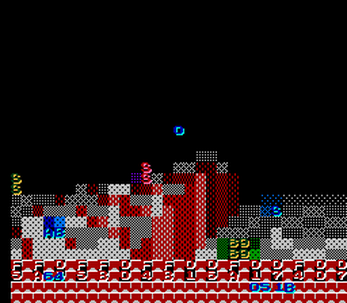
The level's the same, it just has a roof. I added ceilings for performance. It limits draw distance. This was a terrible idea for about three weeks, but now I'm pretty sure it's faster overall. Where it's not, well, I need better levels. That's why the editor is different. Right now I'm trying to compress savegames to where I can call them "passwords" with a straight face. Then people can share levels.
There's mild complexity in how ceilings work, where floors are allowed to stick through them. That's probably less confusing than where red walls also have red ceilings, because again, I do need to make better levels.
Enemies are animated now! Which admittedly looks so-so at current speeds. They're timed with the global vblank counter, which naively cycles every four seconds, so at some point I'll add another byte that only increments every fourth vblank or something. That should make the various bouncing and shifting look much better. Crank the overclocking in Mesen for an idea of what they're supposed to be doing.
But the blue guys do emerge from the floor when you first look at them. That was weirdly easy to implement. Kind of a zombie gimmick, applied to them for now because they're the right height for it. There will eventually be more enemy types, if only because an "invisible" spectre-style monster would also be weirdly easy to implement. It'll change the palette.
I keep coming back to this! It actually reminds me a lot of N64 FPS where a lot of the fun is in understanding the limitations.
I wish it were slightly easier to discern where the enemies were and I usually give up on finding the last 7 or so. There are also little gaps in the level where enemies can shoot from where I can't see them that are kind of annoying.
Is there any chance of it being multiplayer? My son and I love playing against each other in my NES games and I think this would be great.Strike that! I just thought about what I was asking for... split-screen 3d multiplayer on NES ^,^! I think that's a little unreasonable but still....would be a lot of fun!It's a great game honestly! I can't believe it didn't rank higher in the Compo. Congratulations still and thank you for pulling this off!
Ha ha, yeah, splitscreen multiplayer would be ridiculous.
So anyway the splitscreen multiplayer is jump-in co-op with friendly fire. Press Start on controller 2.
Originally this response was going to be within a day of your comment, because this project is so ass-backwards, I figured it would take about three hours to implement side-by-side splitscreen. I was wrong. It took five. Literally one night is all I needed to have two independent viewports, because all column-pairs are independently raycast. Even the FOV is maintained... so I guess this NES game is set for anamorphic 16:9. What I've been doing for the last two weeks, instead of delivering that 'ha ha so anyway' punchline, is finding ways the game breaks if it tries counting to two. If you picture Sideshow Bob in that field of rakes, it's basically that, with more swearing.
I spent an entire day reverse-engineering my own view-weapon code so that removing bits from a byte would make bullets disappear when they hit something. Rendering the other player took literally fifteen minutes. There's a reason all programmers are Like That.
Though if you're playing on PC you'll probably want Mesen to add scanlines after NMI. Single-player performance has been significantly improved. Splitscreen performance needs work.
I can't believe you did it!!
Ever since the multiplayer update we've had so much fun! It run so much better in single player too. The power ups are awesome. I figured out the smoke was from where the bullets landed so I try to use those to find the remaining enemies. Enemies can only shoot at you when you're facing them which is neat since you can only turn around so fast.
At some point we went into edit mode and somehow froze all the enemies and were able to look at them up close and shoot them. Pressing select brought up the code which kind of acted like a map which was interesting. We had some classic fun with hide-and-seek, screen peeking, and betrayal <3
If you wanted to increase performance you could probably cut out the entrails and I'd personally be fine. Sometimes it's useful to see where an enemy just died but there's already a lot going onscreen.
A cartridge release I think would be great. I already want a full color manual with backstory on the enemy characters. Like who are the big bazooka guys? Or the pink slimes? Do they behave differently? Are they from Mars?
I love the "paltry July update"! Everything seems to run smoothly and it may be me but the walls, ceiling, floor all seem to be more distinct. One of my favorite things is to strafe left to right in front of a corner and wig out over how well it renders an apparently 3D environment on the 8-bit system. It makes exploring the new environment a lot of fun. The floaty jumps are a fun feature from previously but seem to be more useful with the new level design. Also the portal door! Very cool feature!
I have a thought on movement. Maybe the start button could be held to speed up turning and swap out with select? Just a thought. I'm actually fine with it as is... I just never use the bombs and could use the button for speeding up yaw motion.
Easily one of my favorite homebrew NES games!
Turn acceleration is going in at some point. Probably after a menu clean-up. (There's a toggle for fast versus smooth rendering, but it's hidden below the last visible option.) In the meantime... Mesen lets you plug an SNES mouse into the second port.
Portals were another weirdly easy absurd feature thanks to raycasting. If you get a close look at enemies through one, you can tell the math is a little goofy. The surface was originally supposed to wobble or flex continuously. That's now limited to when they're shot, because the feedback is hard to distinguish at these framerates, Static-by-default lets one tucked into a corner look like contiguous space - like the one in that high alcove. (Which you can get to, with the glide-y jumping. Definitely keeping the bizarre platforming.)
The shotgun and machinegun might get combined. An amalgamated pew-pew weapon that fires differently based on how you hold B is extremely well-precedented on NES. Though it'd act more like you're always charging a shotgun blast, press B to release it, and spit bullets continuously while holding it. That's honestly more likely to go in "Slaughter 2," after this is complete enough to call a proper game. Anyway that'd free up Select to immediately fire rockets, making them easier and more useful. But so would nerfing the current rate-of-fire so bullets and pellets can get punchier. Even as a firehose of bullets, the sound effects make them sound like a polite suggestion. There'd be some power-up that brings back this rate-of-fire and absolutely rips through enemies.
Enemies should also be crammed into every inch of this level. Blue zombie guys in the green underground. Rabbit tank things around the exit. Their distribution hasn't changed since the compo, because I want the data stored in the same compressed format as the passwords, and that format is currently thrown out so I can start over. (This was not aided by finally discovering that reading data back from VRAM storage begins with a byte of junk. Nintendo. Whyyy.)
All of which has to wait until after GB Compo, which runs for another month. This update was an excuse to avoid my initial project. Two weeks ago I said "Screw it, I wanna play with scanlines!" and honestly it's been great. Expect 60 Hz parallax and a vulgar bird. Then more pew-pew NES stuff.
The Christmas update is so much smoother and faster! In single player it flies and in multi it seems maybe a little bit faster than before.
Great job!
Is there a way to fit both the original level and the new one in the game? I tend to like more open levels like the first (which I absolutely loved) but the new one has more nooks to hide in for a multiplayer session so I think they'd compliment each other well. They're so different they remind me of Goldeneye or Halo levels for matches with different play styles like close-quarters shotguns or long-distance sniping.
So it actually is possible to make Doom on NES.
It's incredibly impressive!
I've seen other attempts at 3d fps games on a variety of 8-bit systems, but none of them even attempted elevated floors.
The graphics could probably be improved by making it less blocky, but it would take a huge drop in framerate, because of the processing power needed to generate new tiles on the fly.
Anyways, it's an amazing tech demo.
NES games tend to have tiles in ROM, so for better or for worse, combining tiles isn't a speed issue, because it's not an option. The character bank in this release honestly has abundant free space. I just haven't committed to diagonals, or marching squares, or approximate 2x2 mini-tiles or whatever. Consoles like this deserve one and handhelds would absolutely require one.
Incidentally the Sega Master System would be fantastic for this. Flippable 16-color tiles, horizontal blanking interrupts, much more RAM. Expect cleaner and faster C code when the judging is over.
I think a Master System version with these improvements would be awesome.
Someone made a Wolfenstein 3D clone for Master System, using its hardware advantages for smooth graphics.
https://www.smspower.org/forums/19054-Maze3d
Ooh, very nice. Tyrannosaurus Tex on GBC did a similar thing with the precomputed diagonals, and honestly still looked kinda... lumpy. Oof. This one looks better in screenshots than in motion. Especially on Game Boy. I was already gonna make an SMS Power account to thank whoever mentioned Slaughter in the "off-topic inspiring technical stuff" thread, but I might do some thread necromancy first to nudge Under4MHz toward choosing tiles directly. Axis-aligned walls have predictable diagonals onscreen. (And every wall in Castle Wolfenstein is aligned with the Axis.)
Kind of interesting how this very quickly went from "I can't tell what's going on at all" to "wait, I'm suddenly seeing how the shapes work and how I'm interacting with everything and this is really cool, actually"
It's really neat that you were able to create something like this!
Interesting stuff! Looking forward to see what this evolves into!
Really interesting game concept and execution! Incidentally, how did you set it up to get the NES ROM to play in the itchio browser window? I assume there's a hidden "play in browser only" zip file with the ROM and an index.html that calls a HTML5 NES emulator, right?
Yep, NinjaPad in a ZIP. Several stumbling blocks: you have to set "kind of project" to HTML, or Itch won't show the "this file will be played in the browser" option for ZIP files. The index.html file genuinely has to be in the root of the ZIP file, not in a folder inside the zip file. And just to make things interesting, NinjaPad may not run locally, because of browser security rules... so my test environment was uploading stuff and hoping that it worked.
Should I be worried how often the least convenient part of retro development is modern websites? GBDK is powerful, cc65 is fast, Open Watcom is flexible, and it once took me three days to send an executable over GMail. I had to rename it attack.com... because that's not suspicious.
Not much of a game as now (works but gameplay is a bit rough) but impressive on such a low-specced machine. Good luck developing this!